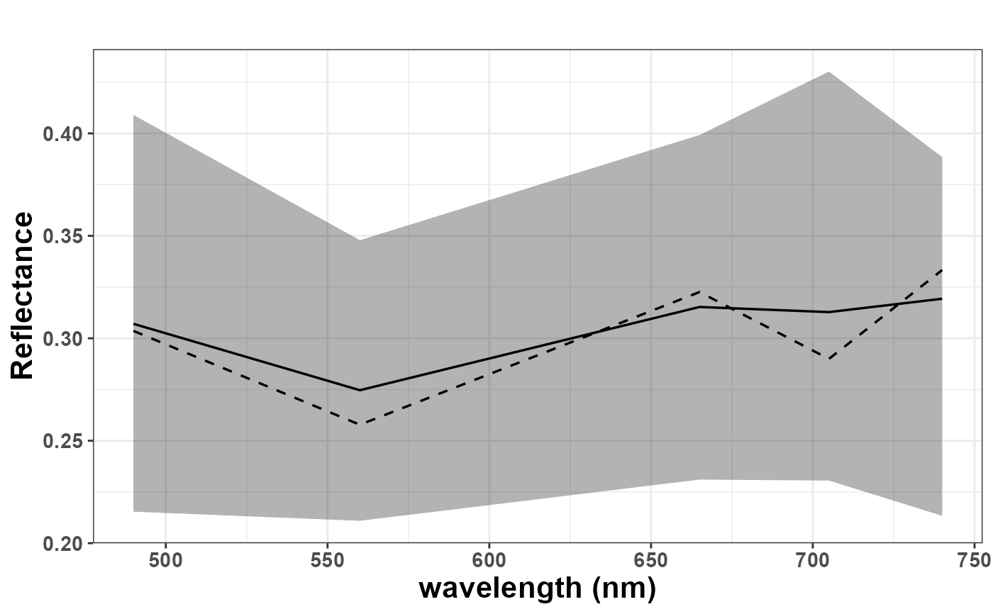
Get a plot with simulations
Arguments
- df
a dataframe
- wave
vector with spectral bands in nm
Value
a plot with average, mean, percentiles
Examples
# Synthetic example: 20 simulated spectra across 5 bands
sim_matrix <- matrix(runif(100, 0.1, 0.5), nrow = 20, ncol = 5)
wavelengths <- c(490, 560, 665, 705, 740)
get.plots(sim_matrix, wavelengths)